Mori.CSS Framework Documentation
Mori CSS Framework is a lightweight, retro-themed CSS library designed for efficiency and simplicity.
Whether you're building a personal blog or a small business site,
Mori provides a seamless experience with its small footprint and easy integration with
popular frameworks like React and Vue. Its array of reusable classes means you can
create diverse layouts and components with minimal effort, maintaining a cohesive
retro aesthetic across your project.
My personal philosophy was to create a framework that can be used as a standalone framework and still be pretty enough.
Goals
- Minimal: Focusing on essential components
- Retro yet Modern
- Customizable
- Lightweight (< 10kb)
- Reusable classes
Getting Started
Installation
To use Mori CSS in your project, include the following link in the <head> section of your HTML
<link href="https://cdn.jsdelivr.net/gh/maishathasin/mori.css/mori.min.css" rel="stylesheet" /> or you can use npm and import it from there
npm i mori.css
This will import the Mori CSS stylesheet into your project, giving you access to all the styles and components.
Several classes can be reused for any components
-
class = "block-fixed":gives a fixed shadow dimension to components -
class = "move":gives a shadow dimension after hovering -
class = "pressable":makes the component look pressable -
class = "round":Any component can be rounded -
class = "color-change":components can change to black when hovered
Cards
Cards are flexible content containers. They are perfect for displaying a variety of content, from blog posts to product listings. Here’s how you can create a simple card:
                <div class="card-wrap" style="width: 20%;">

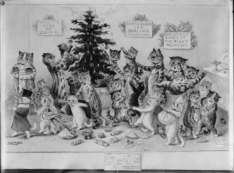
                  <img src="Vintage-cats-2.jpeg" alt="cats" class="card-thumbnail">

                  <div class="card-content blog">

                    <h4>Title</h4>

                    <p>Card description and details.</p>

                    <a href="#">Read More</a>

                  </div>

                </div>


                <div class="card-wrap block-fixed " style="width: 20%;">

                  <img src="Vintage-cats-2.jpeg" alt="cats" class="card-thumbnail">

                  <div class="card-content blog">

                    <h4>Title</h4>

                    <p>Card description and details.</p>

                    <a href="#">Read More</a>

                  </div>

                </div>


                <div class="card-wrap  move" style="width: 20%;">

                  <img src="Vintage-cats-2.jpeg" alt="cats" class="card-thumbnail">

                  <div class="card-content blog">

                    <h4>Title</h4>

                    <p>Card description and details.</p>

                    <a href="#">Read More</a>

                  </div>

                </div>


                <div class="card-wrap  pressable" style="width: 20%;">

                  <img src="Vintage-cats-2.jpeg" a<="cats" class="card-thumbnail">

                  <div class="card-content blog">

                    <h4>Title</h4>

                    <p>Card description and details.</p>

                    <a href="#">Read More</a>

                  </div>

                </div>


                <div class="card-wrap  pressable round" style="width: 20%;">

                  <img src="Vintage-cats-2.jpeg" alt="cats" class="card-thumbnail">

                  <div class="card-content blog">

                    <h4>Title</h4>

                    <p>Card description and details.</p>

                    <a href="#">Read More</a>

                  </div>

                </div>


                <div class="contain block-fixed round" style="width: 20%;">

                  <div class="blog">

                    <h4>Title</h4>

                    <p>Card description and details.</p></div>

                </div>
Buttons
Buttons are used for actions, like submitting forms or navigating pages. Mori provides various styles for buttons. They come in various styles, including flat, raised, and rounded.
            <button class="btn pressable">Pressable Button</button>


            <button class="btn block-fixed">Fixed block button</button>


            <button class="btn move" >Hover Button</button>


            <button class="btn-disabled" >Disabled Button</button>


            <button class="btn color-change round">color chang and round</button>
Tags
Tags are small labels used to categorize or mark items. They can be styled differently based on their purpose.
            <div class="tag pressable" >

                Star on github

            </div>


            <div class="tag block-fixed" >

                Follow maishthasin

            </div>


            <div class="tag move" >

                Star on github

            </div>


            <div class="tag color-change" >

                Star on github

            </div>
Search bar
We can apply similar styles to Search bars also.
        <div style="display: flex; ">

            <div class="card-wrap block-fixed search-bar"></div>

            <input class="card-wrap block-fixed" type="text" id="searchBar" placeholder="Search for blogs">

        </div>


        <div style="display: flex; padding-top: 2%;">

            <div class="card-wrap block-fixed search-bar"></div>

            <input class="card-wrap color-change block-fixed" type="text" id="searchBar" placeholder="Search for blogs">

        </div>
Drop Menus
Dropdowns and Dropup menus are toggleable menus that allow the user to choose one value from a predefined list.
        <div class="dropdown move">

            <button class="dropbtn">Drop down</button>

            <div class="dropdown-content">

                <a href="#">Link 1</a>

                <a href="#">Link 2</a>

                <a href="#">Link 3</a>

            </div>

        </div>


        <div class="dropup block-fixed">

            <button class="dropbtn">Drop up</button>

            <div class="dropup-content">

                <a href="#">Link 1</a>

                <a href="#">Link 2</a>

                <a href="#">Link 3</a>

            </div>

        </div>
Accordion
Accordions are a list of headers that can be clicked to hide or reveal additional content. They are usually used for FAQ/Questions etc.
Content for accordion item 1.
Content for accordion item 2.
        <div class="accordion">

            <div class="accordion-item">

                <input type="checkbox" id="faq-1" hidden />

                <label for="faq-1" class="accordion-title">Accordion Item 1</label>

                <div class="accordion-content">

                    <p>Content for accordion item 1.</p>

                </div>

                <input type="checkbox" id="faq-2" hidden />

                <label for="faq-2" class="accordion-title">Accordion Item 2</label>

                <div class="accordion-content">

                    <p>Content for accordion item 2.</p>

                </div>

            </div>

        </div>
Navigation Links
Navigation links are used in navigation menus. Mori CSS provides various styles for animating these links.
Link animate middle Link animate from left
            <a href="#" class="anchor-animate">Link animate middle</a>

            <a href="#" class="anchor-animate-left">Link animate from left</a>
Code Blocks
Code blocks are used to display blocks of code with a distinct style to differentiate them from regular text.
Sample Code Block
<code class="card-wrap block-fixed">Sample Code Block</code>
Inline
We can add code to inline too, using the class="inline" class
We can also add the reusable styles above like class="inline pressable"
Highlight
We can highlight certain words in our sentenences using the
We can also add the reusable styles above like
Tooltip
        <highlight class="tooltip">
        <span class="tooltiptext round">Tooltip text</span>
        </highlight>
Sidebar
A side bar can be used to emphasise information. We use class= "sidebar" to show this
Radio Buttons
Radio buttons allow the user to select one option from a set. Mori CSS styles them for better visual appeal. We can
use class = "round" to get rounded bullet points.
        <div class="radio-group">

            <input type="radio" id="option1" name="radio-group" class="radio round" />

            <label for="option1"> one</label>


            <input type="radio" id="option2" name="radio-group" class="radio" />

            <label for="option2">two</label>


            <input type="radio" id="option3" name="radio-group" class="radio" />

            <label for="option3">three</label>

        </div>
Typography
This is Heading 1
This is Heading 2
This is Heading 3
This is Heading 4
This is Heading 5
This is Heading 6
Styles
Because of the minimal styles you can easily override to add your own themes and colors, here is an example:
        <div class="tag pressable" style="background-color: palevioletred; font-family: PICO-8;">

            <!-- Pico-8 font from https://fontstruct.com/fontstructions/show/2052852/pico-8-27-->

            pink

        </div>


        <div style="padding: 1%;"></div>


        <button class="btn pressable" style="background-color:plum ;">plum button</button>
Demos
- A minimal starter page for a blog: Blog starter
Contributions
We welcome any and all feedback, contributions, and suggestions! Feel free to raise an issue on the Repo's GitHub Issues or submit a Pull Request.
